35+ Most Popular Responsive HTML5 Framework For Web Design
Responsive frameworks are used by developers all around the world to easy the pressures of a full and complicated development process.
They contain predefined codes that enables your web development process faster and save lot of times. Otherwise, these frameworks provide many functions, helps you to enhance your websites tasks quickly.
Responsive websites also allow the website to smoothly scale to a wide range of different sized devices without the need for an additional mobile/device specific site.
Below, we present 35+ most popular responsive HTML5 framework for every developer to accelerate your development process by a significant amount of time. If you have more to add to this list, please put them in the comments for the rest of the community to know.
1 – Twitter Bootstrap
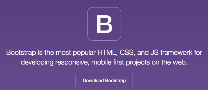
Bootstrap is a powerful front-end framework for faster and easier web development. It includes HTML and CSS based design templates for common user interface components like Typography, Forms, Buttons, Tables, Navigations, Dropdowns, Alerts, Modals, Tabs, Accordion, Carousel and many other as well as optional JavaScript extensions.
Bootstrap also gives you ability to create responsive layout with much less efforts.
2 – Foundation
ZURB Foundation is one of the most popular responsive frameworks present today. It contains HTML and CSS-based design templates for typography, forms, buttons, navigation and other interface components, as well as optional JavaScript extensions. This framework enables the user to create complicated layouts without the need to create a large number of custom elements. This is achievable thanks to the 12-column grid which is able to scale down to arbitrary sizes defined by the maximum width of the rows. Some of the most popular features of Foundation are Interchange, Off Canvas, Magellan, Orbit Slider, Flex Video, Equalizer, etc.
3 – Gumby Framework
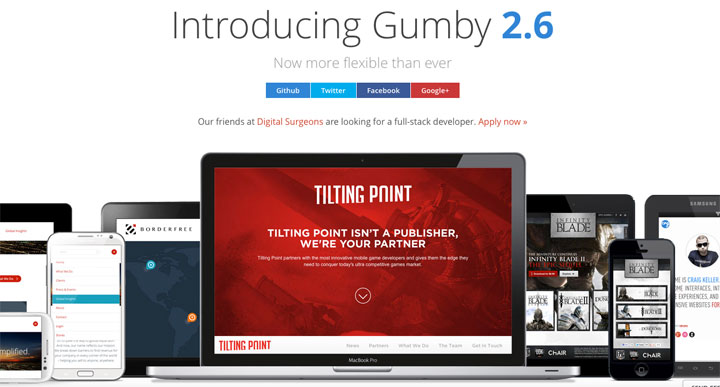
Gumby is an amazing responsive CSS Framework built with the power of Sass, one of the best CSS preprocessor ever built. The use of SASS makes Gumby a high-speed framework with a selection of tools designed to enable the user to build upon the base framework customise specifically to your needs. This is one of the first frameworks to bring the in-built Parallax effect. It works like a charm. Just a simple HTML markup will create smooth parallax effect for you.
4 – Ink Interface Kit
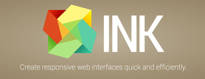
Ink is an interface kit for quick development of web interfaces, simple to use and expand on. It uses a combination of HTML, CSS and JavaScript to offer modern solutions for building layouts, display common interface elements and implement interactive features that are content-centric and user friendly for both your audience and your designers & developers.
5 – Semantic UI framework
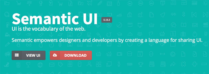
Semantic UI is a modern front-end development framework, powered by LESS and jQuery. It has a sleek, subtle, and flat design look that provides a lightweight user experience. According to the Semantic UI website, the goal of the framework is to empower designers and developers “by creating a language for sharing UI”.
6 – Metro UI
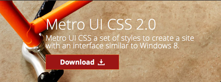
Metro UI CSS a set of styles to create a site with an interface similar to Windows 8 Metro UI. This set of styles was developed as a self-contained solution. There are styles for the popular tiles, images, notices, forms, buttons and typography.
7 – UIkit
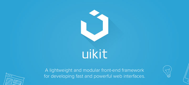
UIkit is a lightweight and modular front-end framework for developing fast and powerful web interfaces. UIkit gives you a comprehensive collection of HTML, CSS, and JS components which is simple to use, easy to customize and extendable. It also gives more flexibility of controlling the grid system in 5 different breakpoints instead of only 4 breakpoints as used in other frameworks.
8 – Skeleton
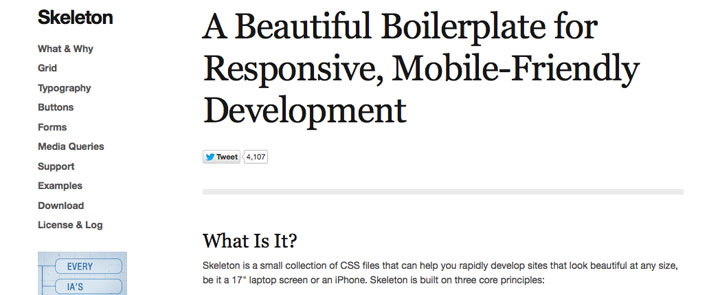
Skeleton is a small collection of CSS files that can help you rapidly develop sites that look beautiful at any size, be it a 17″ laptop screen or an iPhone. The lightweight 960 grid base scales down to mobile phones, tablets and other devices without losing quality.
9 – Pure by Yahoo!
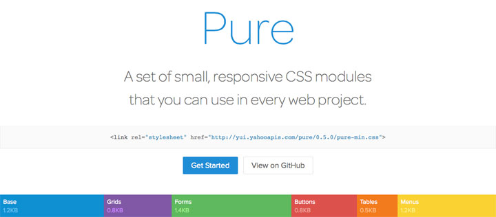
Pure is ridiculously tiny. The entire set of modules clocks in at 4.4KB* minified and gzipped. Crafted with mobile devices in mind, it was important to us to keep our file sizes small, and every line of CSS was carefully considered. If you decide to only use a subset of these modules, you’ll save even more bytes.
10 – Google Web Starter Kit
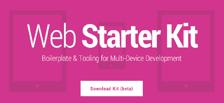
Web Starter Kit is an opinionated boilerplate for web development. Tools for building a great experience across many devices and performance oriented. Helping you to stay productive following the best practices outlined in Google’s Web Fundamentals. A solid starting point for both professionals and newcomers to the industry.
Web Starter Kit strives to give you a high performance starting point out of the box and we actively work on delivering the best PageSpeed Insights score and frame-rate possible.
Web Starter Kit provides boilerplate styles & a visual style guide for projects, but encourages customising these to fit your own site. This may need a little more work, but the reality is that any serious project is going to have its own look and feel. We want you to feel comfortable changing the kit to suit your own needs.
11 – The Responsive Grid System
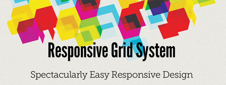
The Responsive Grid System claims not to be a framework, or a boilerplate, but a ‘quick, easy & flexible way to create a responsive website. This development tool will easily plug into existing CSS and HTML and prevents the user from being limited to a fixed number of columns, allowing unlimited columns to give you exactly what you want. It has got minimal CSS and works flawlessly.
12 – HTML5 Boilerplate
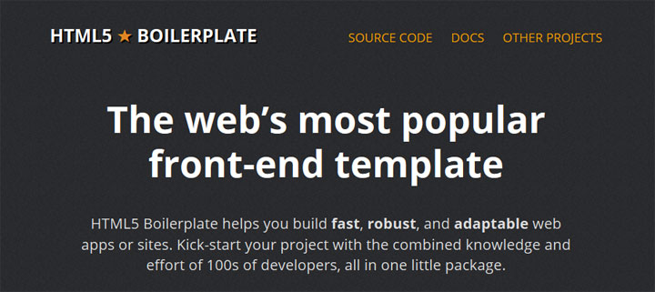
HTML5 Boilerplate is a professional front-end template for building fast, robust, and adaptable web apps or sites.
This project is the product of many years of iterative development and combined community knowledge. It does not impose a specific development philosophy or framework, so you’re free to architect your code in the way that you want.
13 – Base
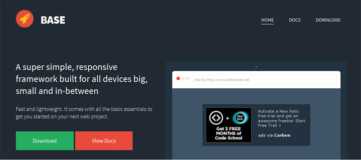
Base is a great simple responsive framework developed in SASS/LESS a powerful CSS pre-processor that helps you write cleaner, more organized and well structured CSS that can easily be maintained over time. It’s designed for use with a wide range of devices, from mobile phones, tablets, PCs, and netbooks and includes all foundation styles for block-quotes, forms, lists, tables, typography etc.
14 – HTML KickStart
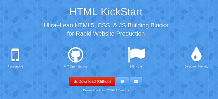
HTML KickStart is an ultra–lean set of HTML5, CSS, and jQuery (javascript) files, layouts, and elements designed to give you a headstart and save you 10’s of hours on your next web project.
HTML KickStart includes everything you need to rapidly create website layouts – things like slideshows, menus, flexible grids, image placeholders, buttons, and more – saving you a ton of time so you can produce faster and make more money.
15 – Kube
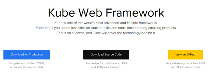
Kube is one of the world’s most advanced and flexible frameworks for creating professional looking websites. It is a minimalistic Web framework for professional developers and designers. Kube helps you spend less time on routine tasks and more time creating amazing products. Focus on success, and Kube will cover the technology behind it.
Here’s your most advanced and flexible web framework. Take a look. Kube doesn’t force you into specific styling, Kube doesn’t require rewriting its code; it leaves all of the important decisions to you and your creative genius. Think about Kube as if it was your most reliable helper, who would do your routine job with a smile on his face, so that you can actually concentrate on something big and wonderful.
16 – Jeet Grid System
Jeet is the most advanced, yet intuitive, grid system on the market today. You can think of it like the spiritual successor to Semantic.gs.
By making use of the power of pre-processors, we can now pass real fractions (or float numbers) as context that generates a percentage based width and gutter for grids. We’re able to do this while maintaining a consistently sized infinitely nestable gutter.
17 – Concise
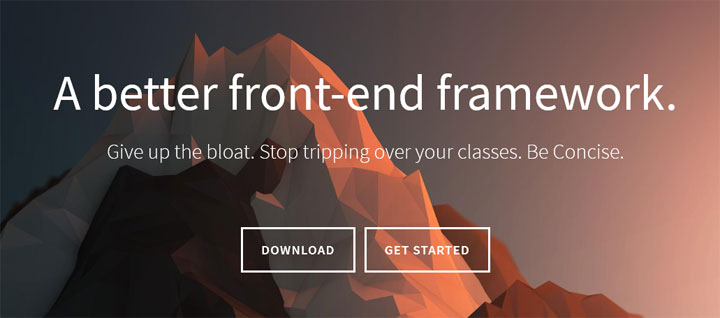
Concise is a lightweight, front-end framework that provides a number of great features without the bloat. Concise is built based on Object-Oriented CSS principles and keeps semantics in mind to provide a small learning curve, but a high level of customization.
18 – Refills
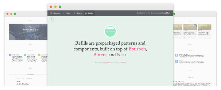
Refills is an impressive collection of patterns, components and type systems. It comes with many pre styled CSS and JS components out of the box. Most of them look inspired from Bootstrap and other frameworks but are presented in a completely different and fresh manner.
19 – MontageJS
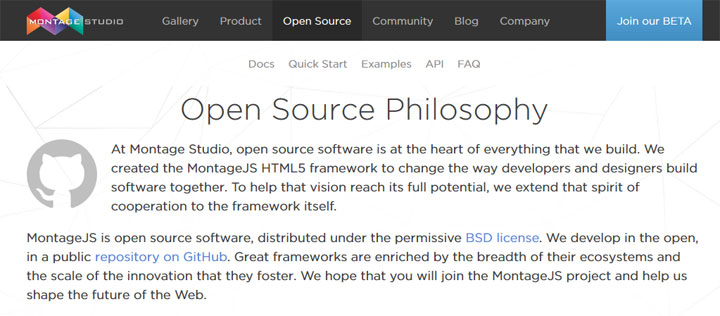
MontageJS is a new type of application framework powered by standard web technologies. Designed with an eye toward maintainability and performance, MontageJS simplifies the development of rich HTML5 applications by providing modular components, real-time two-way data binding, object serialization with DOM mapping, event handling, a managed component draw cycle, CommonJS dependency management, and many more conveniences to help build robust single-page web applications.
20 – Less Framework 4
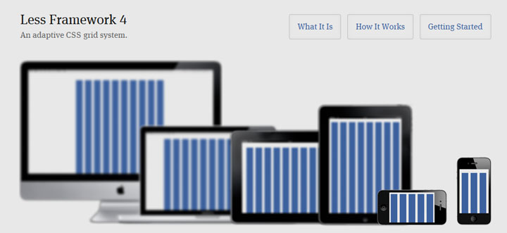
Less Framework is a CSS grid system for designing adaptive websites. It contains 4 layouts and 3 sets of typography presets, all based on a single grid.
21 – YAML
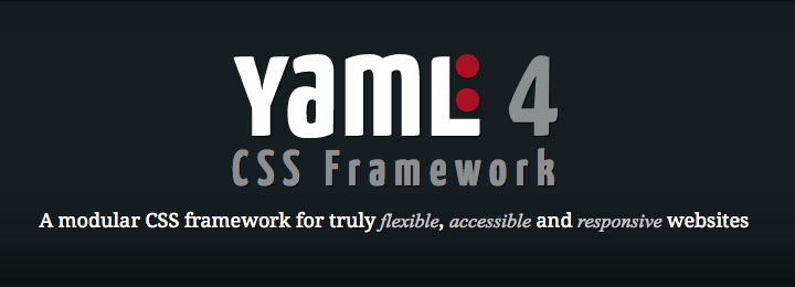
YAML is a modular CSS framework for truly flexible, accessible and responsive websites. It offers some great features such as flexible grid system and flexible forms toolkit with theme-support. It is a very slim framework built on SASS.
22 – Responsable
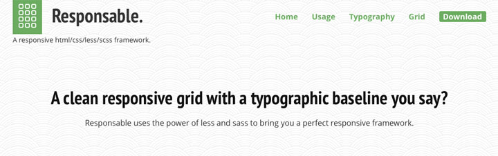
Responsable is a responsive html, css and less framework. It features clean markup, and uses Normalize.css instead of CSS Reset. It offers a baseline-grid and base style. Responsable can be used to quickly code a webpage.
23 – 52framework
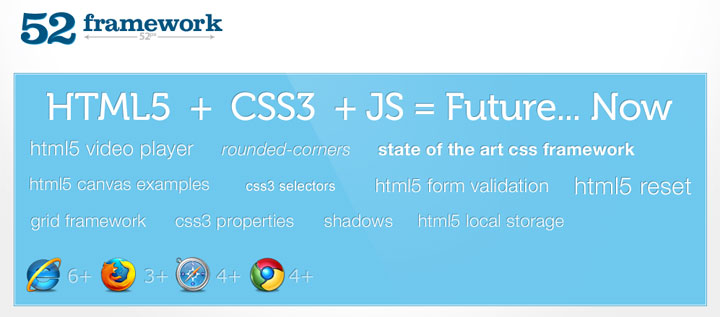
The 52 framework was initiated by the evanu network as a way to accelerate the process of the usage of the latest standards in web development. The 52 framework provides an easy way to get started with HTML5 and CSS3 while supporting the important modern browsers.
24 – KNASS
KNACSS is a minimalist, responsive and extensible CSS framework to kick-start any professional web project no matter its size.
Designed by Alsacreations web agency and used on a daily basis in production, KNACSS relies on common best practices and experience on the topic, provides CSS reset, helpfull snippets, grids and layout tricks even on old browsers.
25 – Responsee
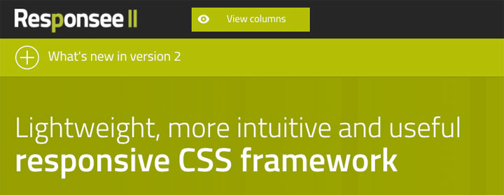
Responsee is an open source responsive CSS framework based on 12-column grid. Websites based on Responsee are fully responsive – they display content correctly on each type of devices.
26 – Groundworkcss
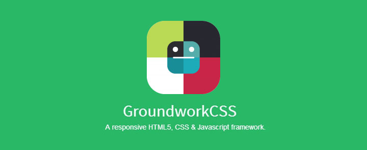
GroundworkCSS is a fully responsive HTML5, CSS and Javascript toolkit created by @ghepting.
Using GroundworkCSS, you can rapidly prototype and create accessible web apps that work on virtually any device. Key features that make GroundworkCSS stand out are:
- nestable, fractional, responsive, adaptive, fluid grid system
- works on virtually anything: mobile, tablet, or large screen devices
- built with modular Sass and CoffeeScript components
- easy to customize
- highly configurable
- supports purely semantic implementations by utilizing Sass @extend, @mixin and %placeholder classes
- built-in ARIA role support
- responsive text and tables
- and much more
27 – Layers CSS
Layers CSS is a lightweight CSS framework that doesn’t emphasize any designs but handles the main structure. It has support for responsive layouts with fluid grids and simple classes are used for dealing with them.
28 -Skel
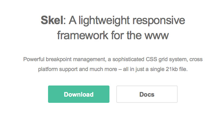
Skel is a lightweight, low-level framework for building responsive sites and web apps. It’s designed to do just enough to make building responsively simpler, faster, and more effective, but not so much it gets in your way.
29 – icecream
Sometimes you just need a grid system, everything else is excess, with the iceCream syntax this can be done easily and faster.
30 – Cascade
Although the overall look and feel are most definitely inspired by Twitter Bootstrap, Cascade framework is not just another Bootstrap clone. Where Twitter Bootstrap puts its focus on delivering shiny user elements that can be dropped into any project and takes control of your project’s overall look-and-feel, Cascade Framework is intended to do the opposite. By splitting your CSS into seperate files based on features rather than selectors as well as by implementing a modifier design pattern inspired by SMACCS and OOCSS, Cascade Framework puts you in control!
Also different from Twitter Bootstrap or other CSS Frameworks out there, Cascade Framework can be used for modern browsers and older browsers alike. All features of Cascade Framework support Internet Explorer from IE6 upwards or degrade gracefully. With Cascade Framework you no longer have to choose between supporting only modern browsers or downgrading your design.
31 – Bijou
Bijou A beautiful CSS framework under 2kb (minified and gzip).
32 – Profound Grid
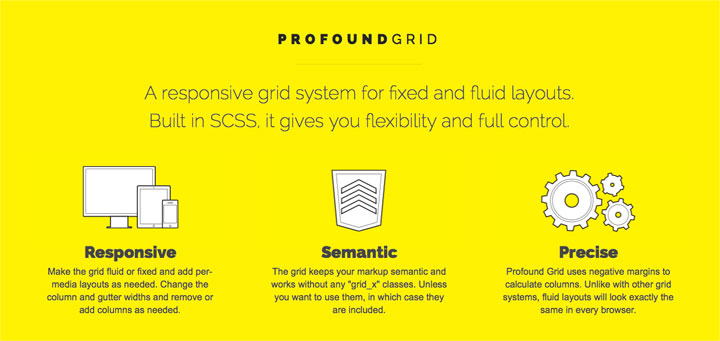
Profound Grid is a responsive grid system for fixed and fluid layouts. Built in SCSS, it gives you flexibility and full control. It make the grid fluid or fixed and add per-media layouts as needed. Change the column and gutter widths and remove or add columns as needed.
33 – IVORY
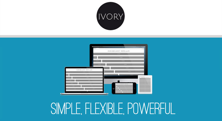
IVORY is a Simple, Flexible, & Powerful responsive web framework, Makes your web development faster and easier. It takes you all the way from 1200px on down to 320px.
With IVORY you can get fluid-grid, will flexibly adapt its grid to the current browser width, that is what they call layout will morph like a Transformer while resizing the browser width.
34 – Almost Flat UI
Almost Flat UI is licensed under a MIT License. It uses Foundation Framework and is heavily inspired from Flat UI Free by designmodo.
35 – Susy
Susy is an agnostic set of tools for creating powerful, custom layouts. We provide the language, but you provide all the opinions. Use a grid, don’t use a grid, or use a combination of grids — it’s all up to you.
36 – TukTuk
TukTuk is a responsive front-end framework that creates extensible sites easily.
- CSS3 powered: The premise is to use as much as possible the features of the latest CSS specification. Don’t try to use Tuktuk in IE6.
- Lightweight & fast: You don’t want to carry heavy stylesheets that only make for a slow loading site. Tuktuk is lightweight at just 9kb gzipped
- Object Oriented CSS: The purpose is to encourage code reuse plus faster and more efficient stylesheets that are easier to add to and maintain.


 Review and analytic your site
 Lookup your IP
 Reciprocal link checker
 List old Pop Disks
 List health tools
 Frameworks, libraries, softwares and resources Network