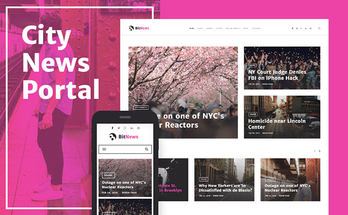
25+ Free Online Responsive Web Design Testing Tools
As consumers access websites from a growing variety of devices, responsive Web design becomes increasingly important. Responsive Web Design is a web development style where a website automatically detects the screen size or device on which it is being presented and adapts it accordingly. it doesn’t only help developers avoid a lot of maintenance work but also provides users an optimal experience. So the demand of responsive websites is growing rapidly with the adoption of Smart phones and tablets.
To help you address these and other responsive Web design challenges, here are several online tools that will help you meet your objectives.
1 – Troy
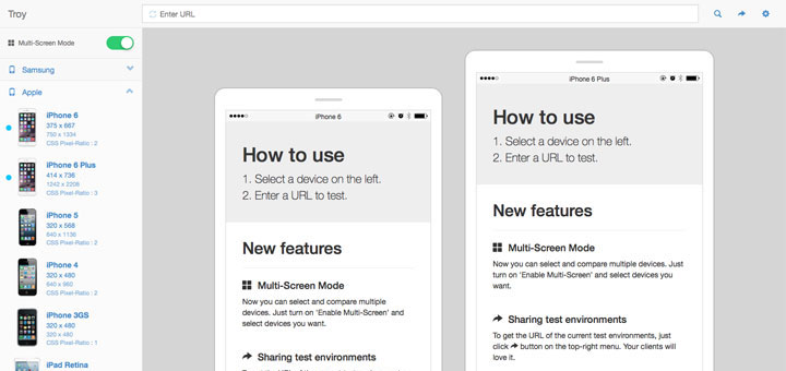
Troy was built to help you to test responsive websites on the various device-widths. it supports many different mobile / table devices such as : Apple, Samsung, LG, Google, HTC, Sony …
With the clear and modem design, this tool is the best choice for you.
2 – Viewlike.us
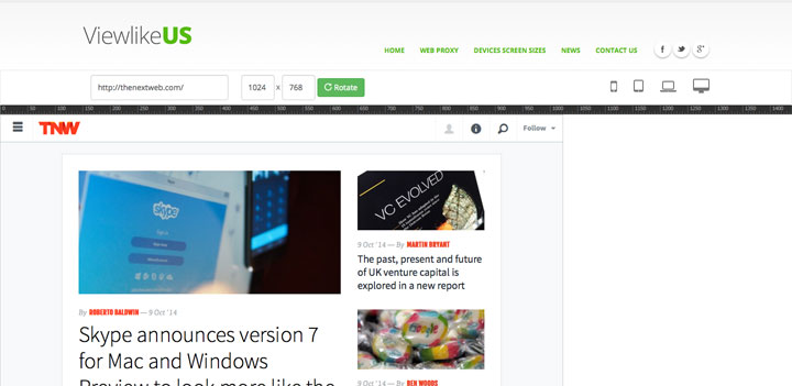
Viewlike.us is basically an online cross-browser testing tool. Just enter a URL to test, and then you choose phone, tablet, laptop or desktop. You can also enter a custom screensize, rotate the screen.
3 – Viewport Resizer
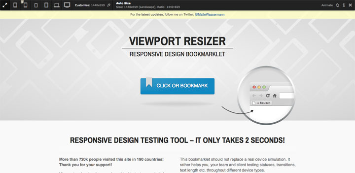
Viewport resizer is a browser-based tool to test any website’s responsiveness. Just save the bookmarklet, go to the page you want to test, click on your created bookmarklet and check all kinds of screen resolutions of the page. This tool is the smartest way to share your defined environment of devices and breakpoints directly with your team and client.
4 – Studiopress
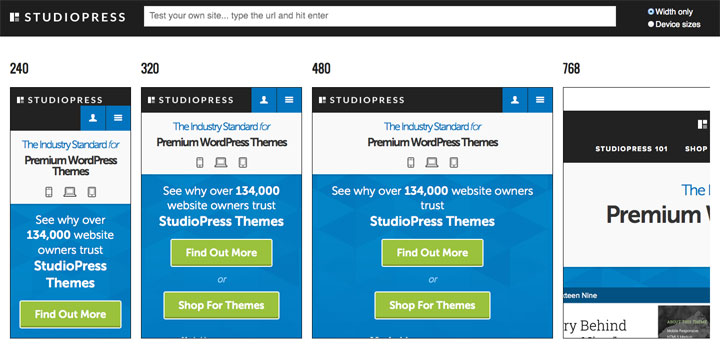
See how your site design looks on different devices — including mobile phone, tablet, and different web browser window sizes
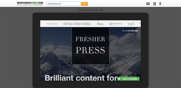
5 – Responsivetest
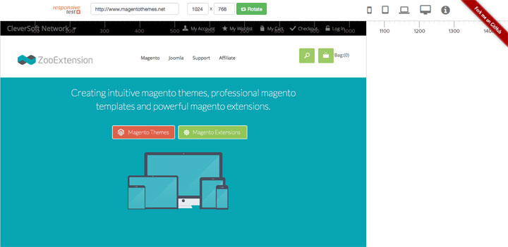
The tool includes a helpful ruler that graphically displays sizes of various screens. In addition, it provides you with numerous standard dimensions starting from small cell phones and ending with large desktop monitors.
6 – Mattkersley
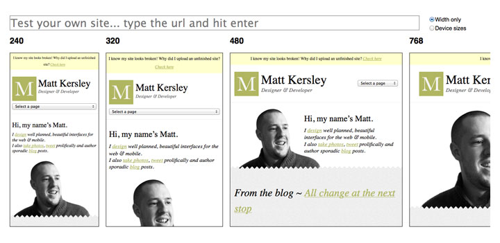
Matt Kersley, web designer and developer, has created a simple tool for testing responsive web designs. This is one of the oldest and time-tested online web tools that provide a standard set of instruments. Although, the functional is slightly limited yet you will still get everything you need for checking responsiveness of your website on most popular devices.
7 – Am I Responsive
Am I Responsive? is a professional web tool that skillfully checks the adaptive characteristics of your website. All you have to do is to enter your link.
8 – Designmodo Responsive Test
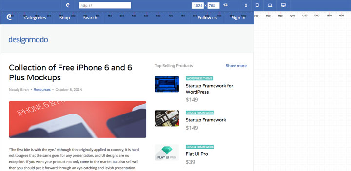
This tool is an advanced but really easy-to-use online tool that will clearly demonstrate a responsive behavior of your project. The tool offers a quite handy grid. You can test your website in many different devices size.
9 – Responsive Design Checker
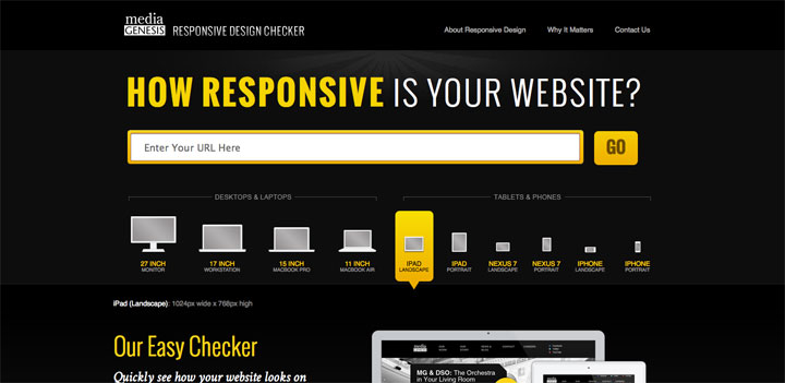
Responsive Design Checker is built to do one thing very well: show you how visual elements of your site respond to different screen sizes.
It won’t show you how various technologies function within your site, so you can’t use it to test things like Flash or video players. Sites that don’t play well with iFrames, including Google, Pandora, and Facebook, will either appear as white boxes or navigate you away from the Responsive Design Checker, and you don’t want that!
This tool isn’t intended to test mobile site versions, so it won’t show you if your site redirects to a mobile version. Some devices, including the iPhone, automatically resize websites to fit the screen, but that’s not responsive design, so you won’t see that here, either.
10 – Responsivetest
Responsivetest shows how your site looks on a variety of devices including the iPhone, iPad and Kindle, as well as a ‘crappy’ Android and a ‘nicer’ Android. All can be viewed in both portrait and landscape
11 – Screenqueri
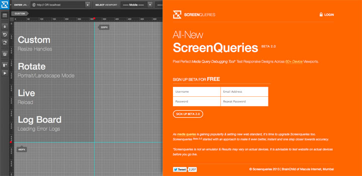
Screenqueri gives an opportunity to test your web project on more than 60 various devices. It is not an emulator & Results may vary on actual devices. It is advisable to test website on actual devices before you go live. The tool is still in beta version and is available only for those who have signed up.
12 – Browserstack
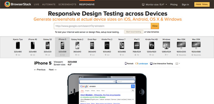
BrowserStack is basically an online cross-browser testing tool and was launch a few years back. It provides designers, developers and testers with a cloud platform in order to test their web applications. BrowserStack has been serving more than 200,000 registered users across the globe.
13 – Responsive Design Bookmarklet
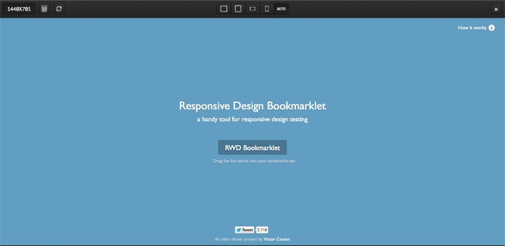
Responsive Design Bookmarklet is a helpful add-on that allows you to monitor the behavior of your website depending on different screen sizes.
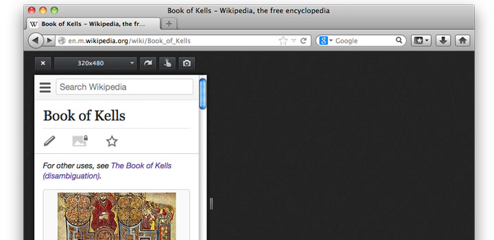
14 – Responsinator
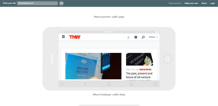
Responsinator is aimed to provide instruments for testing your project on mobile devices and tablets. Thus, you will be able to appreciate the look of your website on iPhone, Android, iPad and Kindle. Every device is presented in portrait and landscape modes. One downside is that you can’t specify any other pixel measurements, so you can only test your site on the devices mentioned above.
15 – Responsivepx
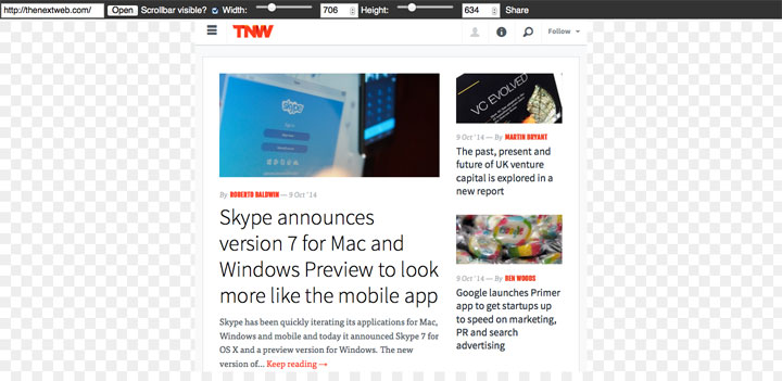
Responsivepx is a responsive emulator which helps you to find the breaking points in your designs so you can alter your media queries accordingly. Just enter the URL and then use the sliders to set the width and height for testing. You can choose whatever screen size you want, up to 3000 pixels in width. You can also share it by email with others.
16 – Respondr
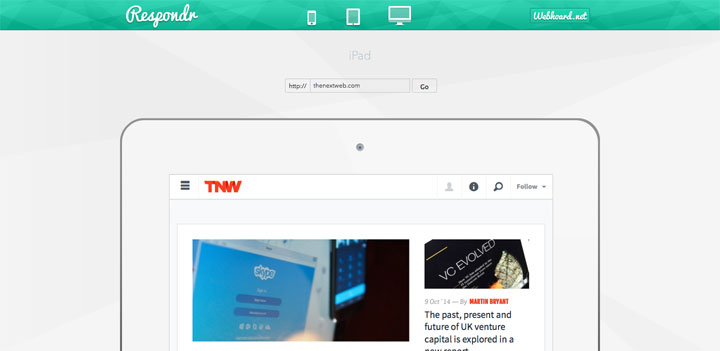
Respondr is a simple, but helpful, tool. You’ll just enter the URL of the site/page that you want to test, and then select the device of your choice. You can select an iPhone, iPad, or desktop. It then previews the page at the appropriate width.
17 – jResize

jResize is a responsive web development tool, built in jQuery to assist the workflow of developers on responsive projects. There are various tools for responsive development, iframes at different widths embedded in the page, and the tedious resizing of the browser. So here’s a different approach which grabs all your HTML, and resizes it inside the browser when you click the width you want. It’s dead simple.
18 – Screenfly
Screenfly by QuirkTools is a nice little responsive emulator that allow you to enter a URL to test, and choose phone, tablet, desktop, or TV. You can also enter a custom screensize, rotate the screen, and generate a URL to share with others for testing.
19 – Resize My Browser
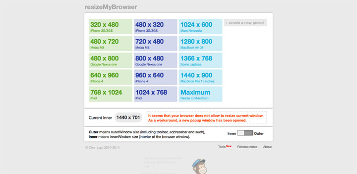
ResizeMyBrowser is one of pioneers of responsive design testing tools. Its goal is to resize browser window depending on specified parameters and as a result, to show how your design will look on it. You can choose between 15 different presets, or you can also create a new preset size which will remain on the menu even after you leave the site.
20 – Demonstrating Responsive Design
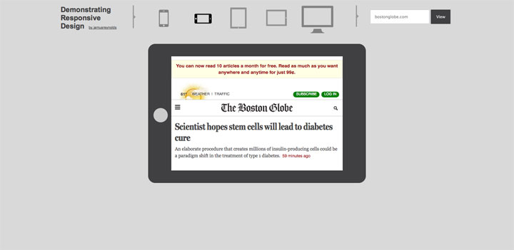
The tool encloses your web project into a frame that corresponds to popular device. It is fairly limited as it only offers 5 screen sizes for testing – iPhone portrait and landscape, iPad portrait and landscape and a standard desktop screen. The dimensions are also not displayed. However, as the name of this tool suggests, it works perfectly well for demonstrating responsive design to clients or a quick test of a media query.
21 – Csschopper Responsive
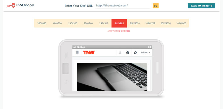
An exceptional online responsive website design testing tool by CSSCHOPPER to test responsive design on different device resolutions.
22 – responsive.is
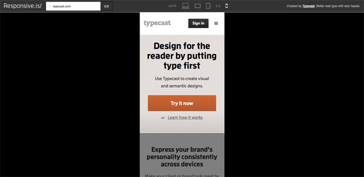
Responsive.is is a clever tool display and present responsive web designs created by Typecast. Just enter a URL to view how the layout presents itself on the Desktop, and in tablets and mobile phones.
23 – Isresponsive
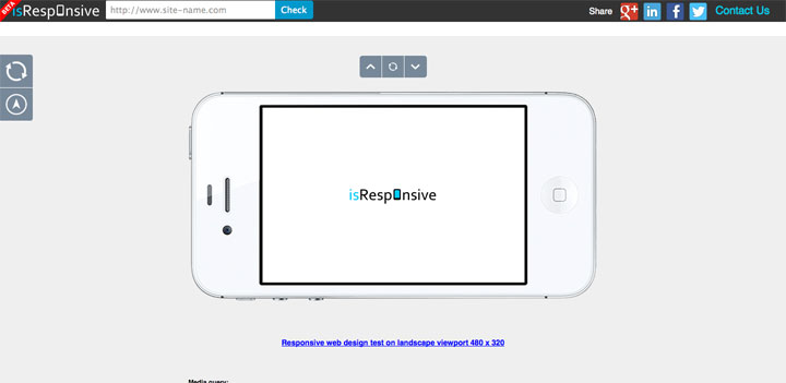
isResponsive is simple online web service giving you the ability to check if your site is responsive designed on most common devices resolutions in one place.
24 – Responsive Web Design Testing Tool
This handy tool has been built to help with testing your responsive websites while you build them. In this manner you can determine if your site is optimized for mobile Internet access or if your site still needs optimization.
25 – Deviceponsive
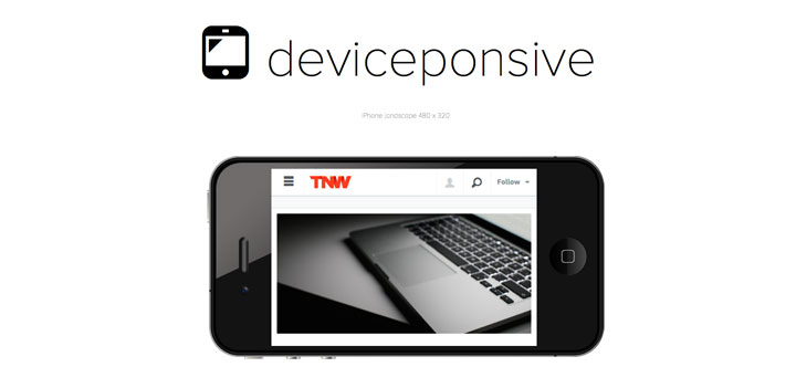
Show a quick preview of your website’s responsive to different device resolutions like Macbook, iPad, or iPhone. share this preview with your client.
26 – Dimensionstoolkit
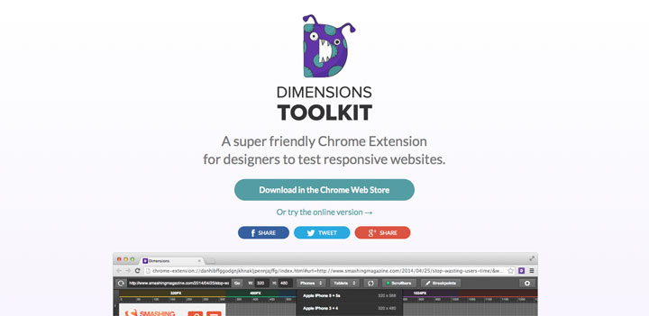
Dimensions App is an advanced checking tool that allows you to test your website even in offline mode. In order to do this you should download an add-on for Google Chrome and simply install it.
27 – Responsive Design View
Responsive designs adapt to different screen sizes to provide a presentation that is suitable for different kinds of devices, such as mobile phones or tablets. The Responsive Design View makes it easy to see how your website or web app will look on different screen sizes.


 Review and analytic your site
 Lookup your IP
 Reciprocal link checker
 List old Pop Disks
 List health tools
 Frameworks, libraries, softwares and resources Network