Cool Image Hover Effect With Pure CSS3
Today we want to share some simple hover effects with you. These effects are suit for eCommerce website and they will help your product page look more attractive. For the icons we are using Font-Awesome and the images are from picjumbo.com
Note that these effects will only work in modern browsers. You’ll have to provide a suitable fallback if you’d like to support for older browsers.
- 35+ Awesome Image Hover Effect With Pure CSS3 – Part 1
- 35+ Awesome Image Hover Effect With Pure CSS3 – Part 2
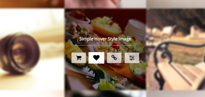
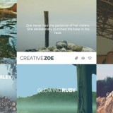
Demo
See the Pen jGrfb by ninodezign (@ninodezign) on CodePen.
An example for one of the style is the following :
HTML Structure
<div class="nd-wrap nd-style-1">
	<img src="img-1.jpg" alt="">
	<div class="nd-content">
		<div class="nd-content_inner">
			<div class="nd-content_inner1">
				<h3 class="nd-title"><span>This is image title</span></h3>
				<span class="nd-icon">
					<span class="fa fa-shopping-cart fa-fw"></span>
				</span>
				<span class="nd-icon">
					<span class="fa fa-heart fa-fw"></span>
				</span>
				<span class="nd-icon">
					<span class="fa fa-link fa-fw"></span>
				</span>
				<span class="nd-icon">
					<span class="fa fa-sliders fa-fw"></span>
				</span>
			</div>
		</div>
	</div>
</div>
CSS
Define style for image / title / content / icon
/* ============================== STYLE FOR IMAGE - TITLE - CONTENT - ICON ============================== */
.nd-wrap {
	overflow: hidden;
	text-align: center;
	margin: 0 auto;
	position: relative;
	display: inline-block;
}
.nd-wrap img {
	width: 350px;
	display: block;
}
.nd-title {
	position: relative;
	top: -150px;
	opacity: 0;
	margin: 0 0 30px;
	font-family: 'Open Sans', sans-serif;
	font-weight: 400;
	-webkit-transition: all 1s ease 0.01s;
			transition: all 1s ease 0.01s;
}
.nd-title span {
	color: #fff;
	padding: 0 20px 15px;
	border-bottom: 1px solid #ccc;
	display: inline-block;
}
.nd-icon {
    color: #000;
    display: inline-block;
    font-size: 25px;
    margin: 0 5px;
    opacity: 0;
    position: relative;
	cursor: pointer;
	-webkit-transition-duration: 0.6s;
			transition-duration: 0.6s;
	-webkit-transition-timing-function: cubic-bezier(1.000, -0.530, 0.405, 1.425);
			transition-timing-function: cubic-bezier(1.000, -0.530, 0.405, 1.425);
}
.nd-icon span {
	background: rgba(255, 255, 255, 0.7);
	border-radius: 3px;
	padding: 10px 15px;
	-webkit-transition: all .2s ease-in-out;
			transition: all .2s ease-in-out;
}
.nd-icon:hover span {
	background: #fff;
	-webkit-transform: scale(1.1,1.1);
			transform: scale(1.1,1.1);
}
.nd-content {
	position: absolute;
	width: 100%;
	height: 100%;
	left: 0;
	top: 0;
	-webkit-transition: all 0.5s ease;
			transition: all 0.5s ease;
}
.nd-content_inner {
	display: table;
	width: 100%;
	height: 100%;
}
.nd-content_inner1 {
	display: table-cell;
	width: 100%;
	height: 100%;
	vertical-align: middle;
}
Create effect for icon / title / content to make them display when hover on image
/* =============== HOVER AREA =============== */
.nd-wrap:hover .nd-icon,
.nd-wrap:hover .nd-content,
.nd-wrap:hover .nd-title {
	opacity: 1;
	top: 0;
}
.nd-wrap:hover .nd-title {
	-webkit-transition: all 0.5s cubic-bezier(1.000, -0.530, 0.405, 1.425) 0.01s;
			transition: all 0.5s cubic-bezier(1.000, -0.530, 0.405, 1.425) 0.01s;
}
.nd-wrap:hover .nd-content {
	background: rgba(0, 0, 0, 0.5);
}
Set delay for icons to make them display in different time
/* =============== SET DELAY FOR ICONS WHEN HOVER =============== */
.nd-content .nd-icon:nth-of-type(1) {
	-webkit-transition-delay: 0.1s;
			transition-delay: 0.1s;
}
.nd-content .nd-icon:nth-of-type(2) {
	-webkit-transition-delay: 0.15s;
			transition-delay: 0.15s;
}
.nd-content .nd-icon:nth-of-type(3) {
	-webkit-transition-delay: 0.2s;
			transition-delay: 0.2s;
}
.nd-content .nd-icon:nth-of-type(4) {
	-webkit-transition-delay: 0.25s;
			transition-delay: 0.25s;
}
Create the hover style effect.
/* =============== STYLE 1 =============== */
.nd-style-1 .nd-icon {
	top: 150px;
}
The effect above is one of 8 effects that we want to show you. You can find others in the download package. We hope you enjoy it !


 Review and analytic your site
 Lookup your IP
 Reciprocal link checker
 List old Pop Disks
 List health tools
 Frameworks, libraries, softwares and resources Network